Redesigning my homepage with GPT-6.2
How a cropped website button, two product names, and a small avatar shaped this revision of saveload.me.
One screenshot settled a design question for me. In an early draft of my English homepage, the bottom of the Website button sat 831 pixels down a 1366 × 768 window. Someone who came to open Proof Take had to scroll before they could do it.
Giving both products a name
The old carousel said “1 / 2.” You could see Proof Take, but you had to advance the carousel to find out what else I’d built. The new selector shows Proof Take and SkillBox by name. The first card stays put until you choose another product or start the slideshow. In one draft, “Autoplay” sat beside the two names and looked like a third product. A separate round play button cleared that up.
I took both screenshots below through the Products link on the English homepage, using the same 1366 × 768 window.
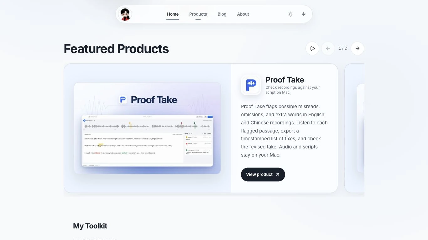
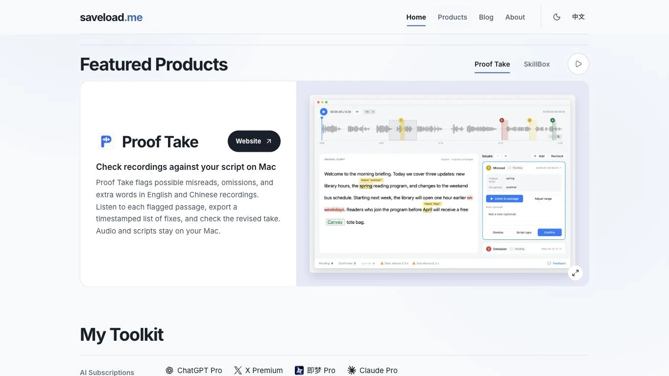
The old artwork repeated the Proof Take name already printed on the card. That space now shows the waveform, a possible misread marked in the script, and the controls for listening to the passage. I moved the Website button up beside the product name. It’s visible when you first open the homepage at the same window height.
Bringing the portrait back
One draft shrank my avatar on the right and set “Santos” in an italic serif. Looking at the two versions, I missed the larger portrait. On desktop it now grows to 208 pixels, enough to make out the black cat. I used the same sans serif for my name as for the rest of the headings and removed the location line underneath.
The footer links the model name to this post. When I next redesign the site, I can open the same product at the same window size and compare it with what shipped today.